
Summary Box
A summary box highlights key information from a longer page or displays next steps, such as links or calls-to-action (CTAs).
Overview
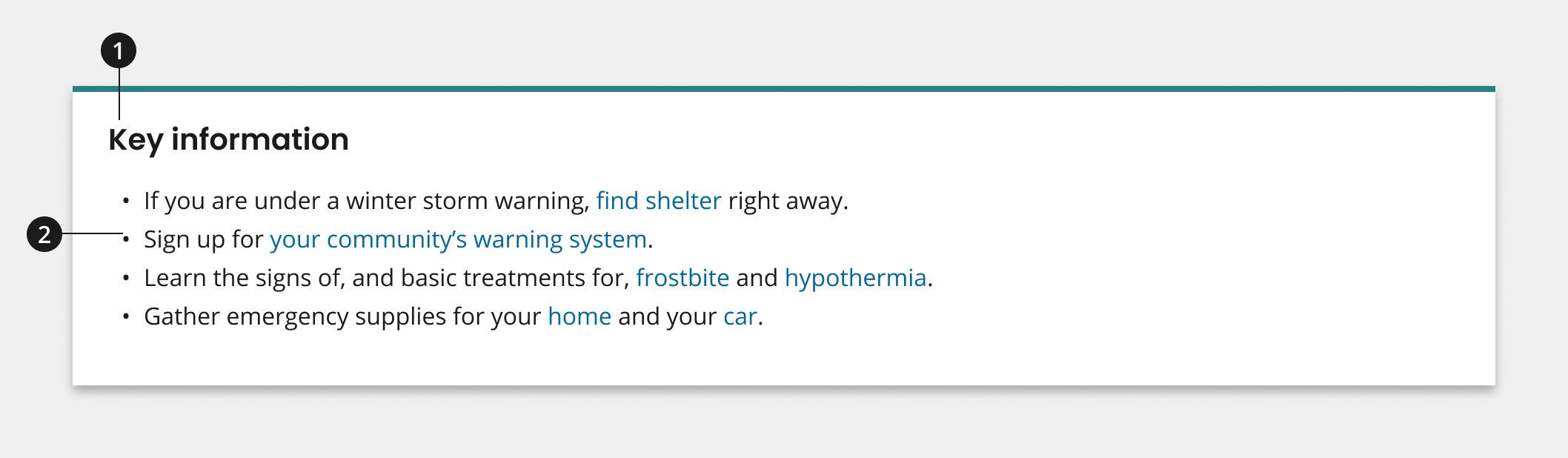
Title
Body Text
Usage
- Use summary box title to describe the key information or next steps presented within the body text.
- Use body text to provide a summary of the page, to display key information covered in the text, or to call out next steps for your user in the form of links or CTAs.
Where to use
Use component on landing and inner pages.
When to use
Use summary box component at the top of page to communicate important next steps or information at the forefront of your content.
When to consider something else
- Driving users to a specific page that could use an image to provide further context.
- Alternative: Card
- Showcasing jump links to the main sections, or H2 headings, covered on your page.
- Alternative: Internal page navigation or an On This Page section
Best Practices
Character Limits
Character limits are strongly recommended to ensure text is concise, scannable, and not visually distorted.
Character limits are based on best practices and when a line of text will be forced to wrap onto a second line of text on desktop.
- Title: 20 characters
- Body text: 250 characters, aim to keep text and CTAs short and descriptive
Patterns
Summary Box Row
- If aiming to provide two different sets of information, next steps or CTAs within your summary box, consider using two summary boxes in a row pattern. Learn more about this pattern on the Summary Box Row Page.
Code Snippets
Summary Box
Component Preview
Key information
- If you are under a winter storm warning, find shelter right away.
- Sign up for your community’s warning system.
- Learn the signs of, and basic treatments for, frostbite and hypothermia.
- Gather emergency supplies for your home and your car.
Packages
Import this Sass partial into your stylesheet.
@forward "usa-summary-box";/* This package should also be imported in your sass stylesheet if not already as Summary Box is dependent on it. */@forward "usa-list";