
Header
The header is the top portion of a web page—it includes a logo, search, and primary site navigation. A header allows users to understand a website's organizational structure and provides a quick, organized way to reach the main sections of a website. The header should be consistent across all the pages of a website.
Overview
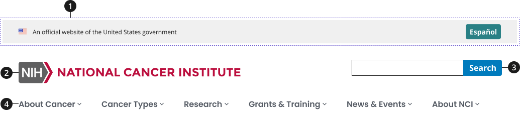
USA banner (required)
Language toggle
- Use only if website offers Spanish translation.
Site alert banner
- Use as needed to display urgent, site-wide messages by NCI or NIH.
Logo (required)
- Must link to the website’s home page.
- Blended logos may be used on websites and applications built as separate sites. Follow NCI branding guidelines on blended DOC logos.
Site-wide search (required with the exception of single page or small websites)
Main navigation (required)
- Use NCIDS Mega Menu if a website has deeper hierarchical needs within its information architecture.
Variations
Choose from following types of header components based on your page's content design or organizational needs.
| Variant | |
|---|---|
| Default header | The header displays primary navigation to users with a search box. |
| Header with mega menu | If your site has a more complex site structure, use a mega menu to display a deeper information architecture. |
Usage
- Include the 'official government website' banner at the top of the header— all federal websites must include this banner.
- List main website sections as links in the horizontal navigation.
- Use dropdown menus to help users, navigate larger websites, or preview lower-level content.
- Do not include more than three levels of navigation in dropdown menus.
- If content has more than three levels, we recommend exploring another navigation pattern or reconsidering the primary navigation links.
- If lower-level sections are closely related and users will need to quickly jump between them, consider using a side navigation instead of — or in addition to — a dropdown.
- Use short, clear link labels. Navigation labels should align with the title of the page they link to, be short, and use familiar terms.
- Use left-justify styling for your labels, as this will make them more scannable.
- Do not model your navigation after your organization's structure. Instead, structure your main navigation to the tasks and information your users need the most.
- Highlight the current section. Use this form of interactive design to show users where they are within the website.
- Conduct research with your users, review analytics, and base decisions about your site's information architecture and navigation structure on your findings.
- Continue researching to update your website's navigational structure based on your users' needs.
- Use the appropriate logo.
- The logo must be 385 pixels wide by 85 pixels high. Stand-alone division, office, and center (DOC) websites may use their DOC blended logo. Web applications may use a program blended logo.
- Use the best logo format. The logo should be an SVG image. They are smaller in file size than PNG images, as well as crisp looking on all types of displays.
- Contact your DOC communications manager, your Office of Communications and Public Liaison communications lead, or the NCI branding team at ncilogoqs@mail.nih.gov with logo questions.
Where to Use
- The header is located at the top of all your webpages.
When to Use
- Use a header across all pages of your website to create a consistent experience. The NCI Design System requires all web pages to have a header, and it specifies which elements to include and their placement.
- Add a navigation to your header. Websites require a form of navigation to help users find the information they need. A horizontal navigation bar is one of the most visible and familiar ways to help users navigate your website.
When to Consider Something Else
- Including contact information or legal disclaimers.
- Alternative: Add this type of information to the footer of your website.
- Publishing content that is nested within a third child page to a main section title.
- This type of content should not be highlighted on the main navigation if it is part of the fourth level in dropdown menus. This type of content can be displayed using the content design of home and landing pages.
Best Practices
Character Limits
- Recommend navigation section names are short, 30 characters maximum.
Image Guidance and Specs
- Logos:
- Only use approved NCI logos for respective DOC sites.
- Widescreen and desktop breakpoints use the "desktop" sized logo (597x50).
- Tablet large, tablet, mobile large, and mobile use the "mobile" sized logo (288x38).
- Mega menu navigation header:
- Only appears at the widescreen and desktop breakpoint.
- Tablet large, tablet, mobile large, and mobile show a menu button next to the search bar.
- Search bar:
- Widescreen and desktop show the search button as the word "search" or "buscar."
- Tablet large, tablet, mobile large, and mobile show a magnifying glass icon for the search button.
Accessibility
- Include skip navigation links to allow users with screen readers to bypass long navigation lists. Make sure to include an id at the beginning of the main content and that it matches the skipnav link. Find more information on these links at WebAIM.
- Include Tab focus for all top-level navigation items—this feature will allow keyboard-reliant users to easily navigate interactive items.
- Ensure your horizontal navigation is keyboard compatible; test to verify users can use Tab to navigate and Space (or Enter) to open pages.
- Avoid using hover to expand dropdown lists. Hover is difficult for some users and won't work on touch screens. Dropdowns should expand on click or with keyboard navigation.
- NCI Design System uses semantic header and nav elements with role="banner" and role="navigation" respectively. role="banner" is your masthead.
- Use multiple nav elements for groups of navigation links, but you should only use one role="navigation" for the main nav of a page.
- If there is more than one search landmark role in a document, provide a label for each landmark. This label will allow an assistive technology user to be able to quickly understand the purpose of each landmark.
- If a search landmark role in a document is repeated in a document, and both landmarks have identical content, use the same label for each landmark. An example of this would be repeating the site-wide search at the top and bottom of the page.
- Use lists for your nav links, which enables screen readers to decipher header contents.
- If using a logo that's an image rather than text, include alternative text for screen readers.
- If using a logo that's text, use an em, not an H1, unless it's the home page. Find more information about logos as images.
- Aria-labels provide an accessible name for an element. If there is no visible name for the element, use aria-label to provide the user with a recognizable accessible name.
Aria-Label Translations Table
| English Label | Spanish Label |
|---|---|
| Header | Encabezamiento |
| NIH National Cancer Institute | NIH Instituto Nacional del Cáncer |
| Search | Botón de búsqueda |
| Primary Navigation | Navegación primaria |
| Cancel | Cancelar |
| Home | Inicio |
Aria-Label Mobile Menu Translations Table
| English Label | Spanish Label |
|---|---|
| Menu | Menú |
| Main Menu | Menú principal |
| Back to Menu | Volver al menú principal |
Code Snippets
Default Header
To enable the default JavaScript interactions, you must add import '@nciocpl/ncids-js/nci-header/auto-init'; to the top of your JavaScript file.
If you need to customize the mobile menu, visit the ncids-js documentation site for more information on developing your own custom JavaScript.
NCI Header with Mega Menu
The NCI header with mega menu requires custom JavaScript to display the mega menu items. Visit the ncids-js documentation site for more information on developing your own custom JavaScript.
Packages
Import this Sass partial into your style sheet.
@forward "nci-header";/* These packages should also be imported in your Sass style sheet if not already as NCIDS header is dependent on them. */@forward "usa-layout-grid";@forward "nci-autocomplete";