
Autocomplete
A form input control providing users with search suggestions in real time.
Overview
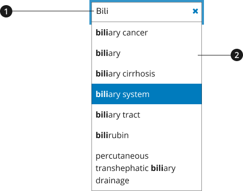
Input box
Search results
Usage
Use the autocomplete component within search opportunities to provide users with suggestions as they type their queries. As a user types, the suggestion bar provides users with related terms based on existing content on your site— preexisting terms aid with spelling and/or concept identification.
Where to use
Use autocomplete functionality when providing users with a search opportunity across your site— this can include a global search functionality for the website or a more regional search experience.
When to use
Use this functionality to minimize users’ time spent when attempting to find specific information, especially when the search opportunity leads to information on wide range of topics.
When to consider something else
- Providing a more specific or defined set of content items.
- Alternative: U.S. Web Design System (USWDS) Select
Best Practices
Character Limits
- Character minimum: Three characters must be entered before the Application Programming Interface (API) is called.
Accessibility
End result should allow users with keywords and/or screenreaders to easily navigate and discern the suggested terms offered.
Screenreader compatibility
As user enters text in the autocomplete input, the screenreader describes the autocomplete functionality as it provides suggestions on the screen— the screenreader will also provide a cue if no suggestions are provided.
If a list of suggestions appears, the number of available suggestions is automatically announced via an aria-live region which is updated as results are returned. The results announcement occur in both English and Spanish.
Aria-Live Region Results Translation Table
| English label | Spanish label |
|---|---|
| {Number} suggestions found, use up and down arrows to review | {Number} sugerencias automáticas. Use flecha arriba o flecha abajo para escuchar las opciones. |
The list of suggestions has a role of listbox so that the screen reader is informed that it contains a list of selectable items.
Keyboard navigation
| Key | Intended Functionality |
|---|---|
ArrowUp, ArrowDown | User may use the Arrow Keys to navigate the list instead of using the Tab key which would take focus away from the input field. |
Enter, ArrowRight | The Enter key should close the list and populate the input field with the selected suggestion list item. Focus stays in the input field. |
Esc | If none of the suggestions suit then keyboard users can press Esc to close the list without changing the content of the input field. Focus stays in the input field. |
Code Snippets
Creation of the aria-live region, listbox and other aria attributed are taken care of in the initialization of the nci-autocomplete. A wrapper is placed around the specified input and its siblings and the necessary divs are added to the DOM.
Autocomplete Options
{AutocompleteAdapter}autocompleteSource- Adapter for the api used with autocomplete providing suggestions as a simple array of strings{boolean}highlightMatchingText- switches on/off functionality for suggestion options to have matching text highlighted via<mark>tags{number}minCharCount- (Default: 3) Minimum number of characters entered before supplied api is polled{number}maxOptionsCount- (Default: 10) Maximum number of options to display in the listbox{string}minPlaceholderMsg- (Default: empty) Message to be shown in listbox when user enters input and until minCharCount is reached{string}listboxClasses- (Default: empty) string of classes to be appended to the listbox wrapper to accomodate additional styling
Events
nci-autocomplete:optionSelected- Fired when a suggestion is selected from the listbox when clicked orEnterkey pressed.nci-autocomplete:submission- Fired when the autocomplete input is submitted
Packages
Import this Sass partial into your stylesheet.
@forward "nci-autocomplete";