Side Navigation
Side navigation is a hierarchical, vertical navigation placed at the side of a page. It allows users to easily navigate through specific sections of the website.
Overview

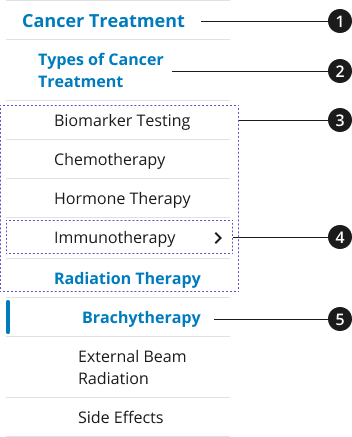
The side navigation component can have multiple layers, or sections, of hierarchical navigation. When using multiple layers, clicking on a header opens or collapses the sub-level navigation items.
Level 1 navigation item
Level 2 navigation item
Level 3 navigation item
Level 3 navigation item with child pages – closed
Level 4 navigation item with child pages – open, active page
Usage
- Side navigation can be used to display single-level and multi-level sections.
Where to use
- Use side navigation on inner pages to allow users to easily navigate to pages located within that section of the website hierarchy.
When to use
- Use a side navigation to support and present your site’s information architecture. Displaying the sub-navigation can help users discover content that is located within sections of your website.
When to consider something else
-
Highlighting related content that might not be structured within the same section of your website’s hierarchy.
- Alternative: Consider the content design of your landing pages and inner pages in order to create associative navigation options by using lists, collections, guide cards, etc.
-
Leading users to promotional content
- Alternative: Consider using components like the promo block or card to lead users to promotional content within a landing page.
Best Practices
Character limits
- Keep navigation section names and landing page titles short, 30 characters maximum (recommended)
Accessibility
- Aria-Labels provide an accessible name for an element. If there is no visible name for the element, use aria-label to provide the user with a recognizable accessible name.
Aria-Label Mobile Translations Table
| English Label | Spanish Label |
|---|---|
| Side navigation | Navegación lateral |
Code Snippets
Side Navigation
Packages
Import this Sass partial into your stylesheet.
@forward "usa-sidenav";