
Combo Box
A combo box helps users select an item from a large list of options by using a drop-down list or by typing in the desired option.
Overview
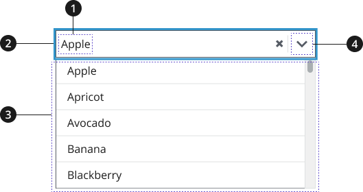
Selection
Input box
Dropdown list
Button
Usage
- Using elements from the USWDS Form component to add a label/call-to-action (CTA) with your combo box is recommended. Use this label/CTA to describe the list of options that users can choose from using the combo box.
Where to use
- Use component on landing pages and inner pages, when appropriate.
When to use
- Use Combo Box component when providing users with both the option to browse through a dropdown list and to type ahead within the search field to find a specific item from the list.
When to consider something else
- Providing users with a small number of options.
- Alternative: List in body text or Summary Box
- When providing users with seven to 15 options within a dropdown list to choose from.
- Alternative: Select
Best Practices
Character limits
Character limits are strongly recommended to ensure text is concise, scannable, and not visually distorted.
- Combo Box: should have more than 15 list options
Accessibility
- Be aware of known accessibility issues. There are known accessibility issues with the original USWDS combo box component that were raised when testing with users of assistive technology. Incorporate fixes as they become available.
- Always use a label. Make sure your select element has a label. Don’t replace it with the default menu option (e.g., removing the “State” label and having the menu read “Select a state” by default).
- Avoid auto-submission. Don’t use JavaScript to automatically submit the form (or do anything else) when an option is selected. Auto-submission disrupts screen readers because they select each option as they read them.
Aria-Label Translations Table
| English label | Spanish label |
|---|---|
| Clear the select contents | Borrar selección |
| Toggle the dropdown list | Pulse la tecla de flecha hacia abajo para desplegar la lista de las opciones |
| When autocomplete results are available use up and down arrows to review and enter to select. Touch device users, explore by touch or with swipe gestures. | Si hay campos que se autocompletan, use las teclas de flecha para conocer las opciones y pulse la tecla Enter para seleccionar. En los dispositivos táctiles, navegue por la pantalla al tacto o deslizando un dedo. |
| {number} suggestions found, use up and down arrows to review. | {number} sugerencias automáticas. Use flecha arriba o flecha abajo para escuchar las opciones. |
| No results found | No hay resultados |
Code Snippets
Combo box
To enable the default JavaScript interactions you must add import '@nciocpl/ncids-js/usa-combo-box/auto-init'; to the top of your JavaScript file.
If you need to customize the combo box, visit the ncids-js documentation site for more information on developing your own custom JavaScript.
Component Preview
Packages
Import one of the following Sass partials into your stylesheet.
@forward 'usa-combo-box';