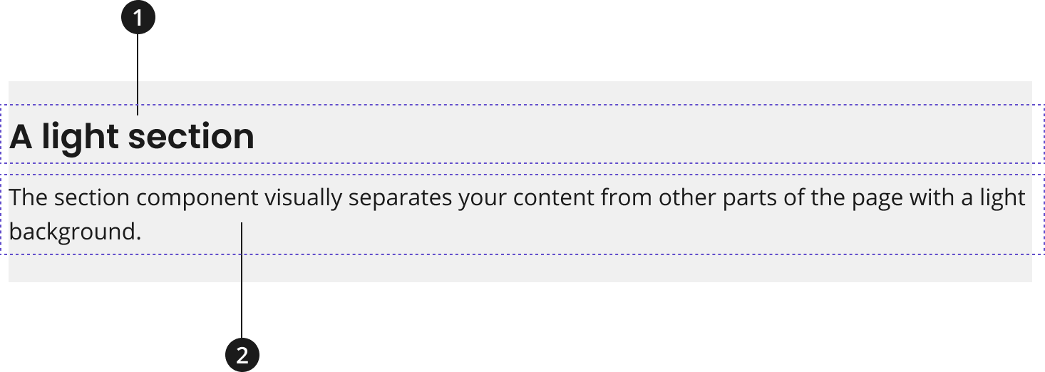
Section
A section is used to visually create a standalone area of content within a webpage. Semantically it can be either a <div> or a <section> element depending on the usage of a label for accessibility.
Overview

Heading
Description
Modifications
Based on your page’s content design or organizational needs, you might need to modify the section component further. Use the follow modifiers to change the theme of your section component.
| Modifier | Description |
|---|---|
| Theme Modifier |
|
When laying out section components in series, a section will automatically reduce its top padding if the preceding section has the same theme. For example, if two light sections are laid out consecutively, the second section will have less padding above it to reduce the space between the similarly themed sections.
Usage
- The section component should be given a label to describe the content and or function served by the component, unless the components within adequately describe this information.
- Give your section a heading to provide a shortened title for the initiative or message.
- Give your section a description to provide a concise description of the initiative or message.
Where to use
- Use component on home, landing, and inner pages.
When to use
- Use when a section of a webpage doesn’t have a more semantically specific component available to describe it.
- Use to create an association between components, if there aren’t existing patterns that can be used to semantically describe the relation between specific components.
- Use to create a visual separation between different piece of content on a page.
- Use to give the "row" of your page vertical padding.
When to consider something else
- When a more semantically specific component is available for your content.
- Review our list of NCIDS Components for other options.
- When a component pattern exists that allows you to create an association between multiple components
- Review NCIDS patterns for other options
Best Practices
Character limits are strongly recommended to ensure text is concise, scannable, and not visually distorted. Character limits are based on best practices and when a line of text will be forced to wrap onto a second line of text on desktop.
- Heading: 50 characters
- Description: 150 characters
Accessibility
- Use Aria-Labels to provide users with an accessible name for a section. This should match or refer to the heading of the section, most likely.
- Utilize the
<section>element to ensure your webpage has appropriate structure. - A
<section>element should not be<section>element without an aria-label or aria-labelledby. If there is no label for the component, then a<div>element should be used instead.
Code Snippets
Default Section
- The section component will default to be the full width of the component's container, without margins or horizontal padding.
- A component that covers the full width of the container without margins would likely be a direct child element of the section component.
<div class="usa-section">This is example text in a default section. Notice the lack of margins on the left and right, as the section occupies the full width of the container. Your HTML would go here in place of this text.</div>
Accessible Section with Label
- A section that uses the
<section>element should utilize an aria-label for accessibility purposes.
<section class="usa-section" aria-label="A section with an aria-label">This is example text in a section with an aria-label describing the section. Your HTML would go here in place of this text.</section>
Accessible Section Labeled by Another Element
- A section that uses the
<section>element should utilize an aria-labelledby attribute for accessibility purposes when it has a heading or other content appropriate for labelling the section.
The Heading Labelling the Section
This is example text in a section with a heading that is describing the section with an aria-labelledby attribute.
<section class="usa-section" aria-labelledby="heading"><h2 id="heading">The Heading Labelling the Section</h2><p>This is example text in a section with a heading that is describing the section with an aria-labelledby attribute.</p></section>
Applying Standard Page Margins
- A grid-container class should be applied to child elements of the section component that need standard margins applied.
- By using this class, auto margins will be applied, and a max-width will be given to the element based on our standard grid-container width. This will also apply a small amount of padding-left/right to the element.
- Components that would normally fall into the standard content container would utilize this structure.
<div class="usa-section"><div class="grid-container">This is example text in a section with standard margins. Note the margins on the left and right of the section in addition to the default padding on the top and bottom of the section. Your HTML would go here in place of this text.</div></div>
Light Section
Use this theme modifier to display a section with a light background.
<div class="usa-section usa-section--light">This is example text in a section with the light modifier. Note the background color of the section. Your HTML would go here in place of this text.</div>
Dark Section
Use this theme modifier to display a section with a dark background.
<div class="usa-section usa-section--dark">This is example text in a section with the dark modifier. Note the background color of the section and the text color. Your HTML would go here in place of this text.</div>
Sections in Series
This is an example of several sections in series. Note the lack of double padding between the two light sections, the section component will reduce the top padding of the second same-themed section when they are laid out consecutively.
Packages
Import this Sass partial into your stylesheet.
@forward "usa-section";