
Hero
A full-width hero image with a tagline, and option to add a call-to-action (CTA) button and/or a CTA strip of 2-3 buttons.
Overview
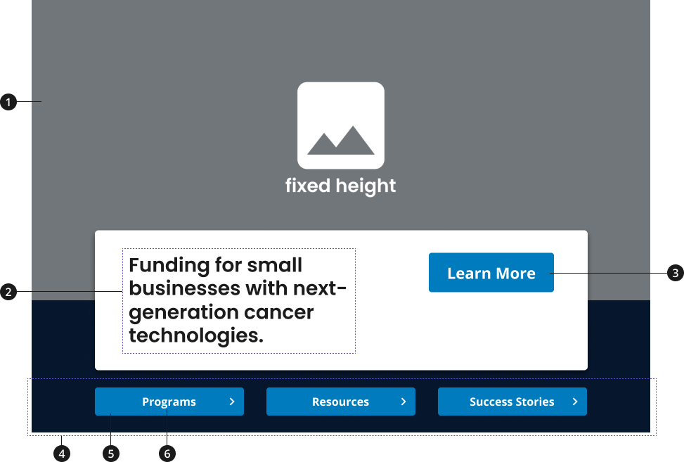
Background image
Tagline
Primary call-to-action button (Optional)
Call-to-action strip (Optional)
Button
Button label (Required, if using button)
Variations
Choose from the following types of hero components based on your page's content design or organizational needs.
| Variant | Description |
|---|---|
| Hero [Default] | The default hero component is a light-themed hero with a tagline and an optional primary CTA button. |
| Hero with CTA strip | If more than one CTA needs to be prominently featured, use the "Hero with CTA Strip" variant to add a CTA strip to your hero component. |
Modifications
Based on your page's content design or organizational needs, you might need to modify the hero component. The following modifiers are available to change the theme of your hero component or to add relevant CTA button(s).
| Modifier | Description |
|---|---|
| Theme Modifier |
|
Usage
- Use tagline to set the tone for the site or section of the site.
- Use primary CTA button when pointing to the most important "next step" for user to take from the home or landing page.
- Use buttons on a CTA strip when providing users with links to two or three related CTAs. CTAs can lead to internal or external pages.
- Use descriptive, concise button labels within CTA buttons to indicate to user what page they will navigate to upon clicking.
- Use either a light or dark theme depending on the imagery and themes of your page to create a sense of cohesion and flow for the user.
Where to use
- Use the hero image at the top of your home page and landing pages to set the tone for the site or section of the site.
When to use
- Hero with tagline only: Use component to communicate a high-level overview of the content of your site or for a section of your site.
- This variation should be used if the page does not need to display a CTA more prominently than others on the page, or if a CTA does not communicate the main purpose of the home page or landing page.
- The tagline should highlight the page's main initiative(s) and entice the user to scroll through the page.
- Hero with primary CTA button: If there is a primary CTA for the home page or landing page, use the CTA button option to display both a tagline and a prominently displayed CTA. This CTA should be the most important “next step” you want users to take on your site.
- Hero with CTA button or with tagline only and CTA strip: If the page has three-four CTAs, use the CTA button option to prominently display a CTA alongside two to three important CTAs. The CTA strip should only be used with Hero components using the light theme.
When to consider something else
- Showcasing CTAs for major initiatives or content marketing items that aren't the main purpose of the site or section and should be described further through an image and description.
- Alternative: Promo block
- Showcasing multiple content items that rely on their title and description to convey a message.
- Alternative: Card, using the 3 Card Row pattern
Best Practices
Character limits
Character limits are strongly recommended to ensure text is concise, scannable, and not distorted. Character limits are based on best practices and when a line of text will be forced to wrap onto a second line of text on desktop.
- Tagline:
- Hero with CTA button: 28 characters
- Hero with tagline only: 56 characters
- [Optional] Button label text: 20 characters
Image guidance and specs
- Widescreen Breakpoint
- Fixed Height
- Upload Size - 2800px x 854px (@2x retina)
- Desktop Breakpoint
- Fixed Height
- Upload Size - 2048px x 854px (@2x retina)
- Tablet Large Breakpoint
- Fixed Height
- Upload Size - 1760px x 854px (@2x retina)
- Tablet and Mobile Large Breakpoints
- Aspect Ratio - 16:9
- Minimum Upload Size - 1280px x 720px (@2x retina)
- Mobile Breakpoint
- Aspect Ratio - 1:1
- Minimum Upload Size - 640px x 640px (@2x retina)
External Links
For CTA Strip buttons that have links outside of .gov and other supported sites, an external link icon will be added at the end of the button's title to indicate that the link will go to an external site. This icon is added automatically based on where the link the is going to, but can also be overridden to display or be hidden regardless of the link.
- To override an INTERNAL link to be displayed as EXTERNAL, add the class
ncids-external-linkto the anchor (<a>) element. - To override an EXTERNAL link to be displayed as INTERNAL, add the data attribute
data-ncids-internal-linkto the anchor (<a>) element.
Accessibility
.usa-sr-onlyprovides an easy way to include contextual information to Learn More links in the hero call to action button.
Code Snippets
Default Hero

NCI is the nation's leader in cancer research.
Hero with Button
Hero with Button with External Link Icon
Hero with Button Internal Link with External Link Icon Override
External Link with Internal Link Override
Default Hero with Button & Text Box and CTA Strip
Default Hero with Button & Text Box and CTA Strip External Links
Hero Dark
NCI is the nation's leader in cancer research.
Hero Dark with Button