
Site Alert
A site alert can be used to communicate urgent site wide information.
Overview
A site alert can be used to communicate urgent site wide information.
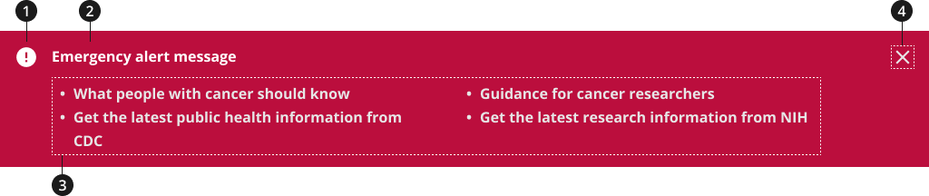
Icon
Site alert header
Site alert description
(Optional) Close alert icon
Variations
Choose from the following types of site alert components based on your organizational needs.
| Variant | |
|---|---|
| Default site alert | Use the standard site alert component to display several bullets of information regarding the alert. |
| Slim site alert | Use the slim site alert component to display a short alert message. |
Standard Site Alert - Initial
- Use relevant modifiers below to add closing and expanding functionalities to your component
- Use relevant modifiers below to change the color from the default gray to an appropriate color — the color gray is not recommended
Slim Site Alert - Initial
- Use this variant of the site alert component if there is no further information to provide. Or, if it is more appropriate to provide a link to further information.
- Use relevant modifiers below to change the color from the default gray to an appropriate color — the color gray is not recommended
Modifications
Based on your organizational needs and your page’s content design, you might need to modify the site alert component. The following modifiers are available to add additional functionality to your site alert and/or to change the background color.
Emergency Modifier
- Use this modifier to change your site alert background color from the default color, gray, to the emergency color, red.
Info Modifier
- Use this modifier to change your site alert background color from the default gray color to the light blue info color.
With Close Modifier
- Use this modifier to add a close functionality for users to close or dismiss your site alert. This will display as an [X] in the top right corner of your site alert.
- The close modifier can be used with the expand modifier.
- The close modifier can also be used with either the emergency or info modifiers.
Expand modifiers
- Use this modifier to add an expand/collapse functionality to your site alert component. This will organize the site alert content and allow you to hide additional information in a collapsible section in order to not overwhelm users.
- The expand modifier can be used with the close modifier.
- The expand modifier can also be used with either the emergency or info modifiers.
Usage
- Avoid using overwhelming colors, such as bright red or orange, to draw attention to a non-emergency site alert— these colors can produce strong reactions such as fear or panic in users.
- Optional: If adding more than one site alert, provide a list of links within a single site alert instead of multiple, stacked alerts. A dropdown will appear on your site alert that can be opened and closed to reveal links in a bulleted list.
- Optional: Give users the ability to close a site alert so the alert no longer appears at the top of the page while they browse the website.
Where to use
- Position full-width site alerts prominently near the top of the page so it's one of the first items seen by users.
When to use
- Use to share critical system notifications or updates with users, such as notices about unavailable services or content.
- Use to share messages that should be displayed on every page. A site alert makes critical information visible on every page.
- Use the info modifier (blue) for COVID site alert content. Do not change icons, text, colors, links, or functionality.
- Use the red site alert for government shutdowns. Use this alert according to NCI's policy. Do not change icons, text, colors, links, or functionality.
Accessibility
- Don't visually hide alert messages and then make them visible when they are needed. Users of older assistive technologies may still be able to perceive hidden alert messages. Fully remove alert messages when they're not needed.
- Each aria-label must be unique to the page and should describe the purpose of the alert.
Aria-Label Translations Table
| English label | Spanish label |
|---|---|
| Dismiss Alert | Cerrar notificación |
| Toggle alert message | Abrir o cerrar notificación |
Code Snippets
Default site alert - emergency
To enable the default JavaScript interactions you must add import '@nciocpl/ncids-js/usa-site-alert/auto-init'; to the top of your JavaScript file.
See the Site alert for more information regarding the site alert's initialization.
Default site alert - emergency with two column lists
Default site alert - info
Slim site alert - emergency
Slim site alert - info
Site alert with close button
To enable the close button with the auto initializer, you must add the data attribute data-site-alert-closeable to the site alert component.
See the Site alert for more information regarding the site alert's initialization.
Packages
Import the following Sass partials into your stylesheet.
@forward 'usa-site-alert';