
Button
Buttons are interactive elements that communicate action, conveying a specific call-to-action (CTA) for users to take on a webpage.
Overview
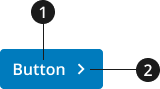
Label
Icon
Variations
Choose from following types of button components based on your page's content design or organizational needs.
| Variant | |
|---|---|
| Default button |
|
| Outline button |
|
| Unstyled button |
|
Modifications
Based on your organizational needs, you might need to modify the button component. The following modifiers are available to change the color or and/or size.
| Modifier | |
|---|---|
| Full width | Use this modifier to change the width of your button component to be the full width of its container. |
| Big size | Use this modifier to make a bigger button. Use when you need a more prominent call to action (CTA) on your page. |
| Small size | Only use this small button modifier when space is at a premium. |
Usage
- It is important to differentiate when a button uses an anchor to drive users to internal and external links, and when the button is completing another action.
- Anchor link buttons should be used within components to draw attention to the call-to-action. These buttons should not be used within text to direct users to other pages or to different headings within a page.
- If a button is performing a different action (i.e. submitting a form, opening/closing a dropdown, etc.), an anchor should not be included.
- Use sentence case for button labels.
- Write button label text that is short and actionable.
- Use a verb for the first word of your button text label. Keep the text as short as possible with action words that clearly explain what will happen with the button is selected (e.g., Download, Learn more, or Sign up).
- To create a more accessible user experience, use the aria-label to describe the desired action or next step in more detail (e.g., “Learn more about...” or “Sign up for...”)
- When pointing to informational pages, include a succinct version of the page name within the button.
- To make a CTA stand out, use the big modifier or the most visually distinct color modification.
- Consider using the icon modifier to add an icon to a button. Use an icon to signal specific actions (Download, Open in a new window, etc).
Where to use
- Use buttons to identify important actions users should take on your website, such as Download, Sign up or Log out.
- Avoid using too many buttons on a page— this can cause decision fatigue and confusion, resulting in users not actually clicking on anything.
When to use
- Use buttons to identify important actions users should take on your website, such as Download, Apply, Learn more, etc.
When to consider something else
- Use a link styled using .usa-link when linking to internal and external pages within text, or if the action is less popular or less important.
- Use a link styled using .usa-link when linking users to a location on the same page.
Best Practices
Character limits
- Button text label: 30 characters (recommended)
External Links
An external icon will be automatically added to all buttons that link to non-federal government (.gov) websites. This icon will be added after the button's text to indicate that the link will go to an external site. The external icon can be overridden to display or be hidden regardless of the link.
- NOTE: An external button should always be an anchor element (
<a>) styled as a button with.usa-button.
External Link Overrides
To override an INTERNAL link and display it as an EXTERNAL link, add the following class to the button. Using this class will add an external icon to the collection item.
usa-button--external
- NOTE: This class should be added to the HTML element that already has the class
.usa-button.
To override an EXTERNAL link and display it as an INTERNAL link, add the following data attribute to the button. Using this data attribute will remove an external icon from the collection item title.
data-ncids-internal-link
- NOTE: This should be the element that has the class
.usa-button.
Examples of the HTML can be found below in our Code Snippets section.
Accessibility
- Buttons should display a visible focus state when users tab to them.
- Use standard markup. Avoid using
<div>or<img>tags to create buttons. Screen readers don't automatically know either is a usable button. - Screen readers handle buttons and links differently. When styling links to look like buttons, remember that screen readers handle links slightly differently than they do buttons. Pressing the Space key triggers a button, but pressing the Enter key triggers a link.
- Use the browser-native disabled attribute for any disabled button. Don't use usa-button--disabled, which is intended only for debugging and prototyping.
Code Snippets
Default Button
<button class="usa-button">Default</button><button class="usa-button usa-button--secondary">Secondary</button><button class="usa-button usa-button--accent-cool">Accent Cool</button><button class="usa-button usa-button--accent-warm">Accent Warm</button><button class="usa-button usa-button--base">Base</button>
Outline Button
<button class="usa-button usa-button--outline">Default</button><button class="usa-button usa-button--outline usa-button--secondary">Secondary</button><span class="bg-ink padding-2"><button class="usa-button usa-button--outline usa-button--inverse">Inverse</button></span>
Unstyled Button
<button class="usa-button usa-button--unstyled">Unstyled Default</button>
Size Modifications
<button class="usa-button usa-button--big">Big Default</button><button class="usa-button usa-button--nci-small">Small Default</button>
Width Modifications
<button class="usa-button usa-button--nci-full-width">Full Width Default</button>
Other Elements as Buttons
<a href="#" class="usa-button">Link</a><button type="submit" class="usa-button">Submit Button </button><input type="button" class="usa-button" value="Button Input" /><input type="submit" class="usa-button" value="Submit Input" /><input type="reset" class="usa-button" value="Reset Input" />
Disabled Button State
<button class="usa-button" disabled>Disabled Default</button><button class="usa-button usa-button--outline" disabled>Disabled Outline</button><button class="usa-button usa-button--unstyled" disabled>Unstyled Outline</button>
Disabled Link State
<a class="usa-button" aria-disabled="true" tab-index="-1">Disabled Link</a>
External Links
<a href="https://www.google.com" class="usa-button">External Link</a><a href="https://www.cancer.gov" class="usa-button usa-button--external">Internal Link Displayed as External</a><a href="https://www.google.com" class="usa-button" data-ncids-internal-link>External Link Displayed as Internal</a>
Packages
Import this Sass partial into your stylesheet to import all button variants.
@forward "usa-button";