
Guide Card
A card component composed of an image (available for some variants), description (available for some variants), and between two and six call-to-action (CTA) buttons.
Overview
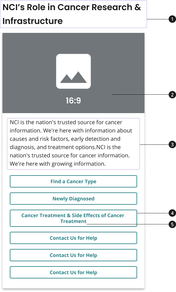
Heading
Image
Description
Link Button
Button label
Variations
Choose from following types of button components based on your page's content design or organizational needs.
| Variant | |
|---|---|
| Default Guide Card |
|
| Guide Card with Image and Description |
|
Usage
- Use heading to introduce the two to six CTAs featured on your guide card.
- [Not available for all variants] Use image and description to provide context for your group of CTAs and to explain how they relate to the larger message shared on your page.
- Use CTA buttons to provide users with links to two to six related CTAs. CTAs can lead to internal or external pages.
- Use descriptive, concise button labels within CTA buttons to indicate to user what page they will navigate to upon clicking.
Where to use
Use component on home, landing, and inner pages.
When to use
Use Guide Card with Image and Description within the body of your page to direct users to CTA links (at least two and up to six) that drive to important content items for that audience.
When to consider something else
- Showcasing CTAs for major initiatives or content marketing items that should be described further through an image and description.
- Alternative: Promo Block
- Showcasing one primary CTA or four CTAs that should be more prominently displayed than all other information on the page.
- Alternative: Hero with CTA Button
- Showcasing one primary CTA or four CTAs that should be more prominently displayed than all other information on the page.
- Alternative: Hero with CTA Button
- Alternative: Hero with CTA button + CTA strip or a Hero with tagline only + CTA strip
Best Practices
Character Limits
Character limits are strongly recommended to ensure text is concise, scannable, and not visually distorted.
Character limits are based on best practices and when a line of text will be forced to wrap onto a second line of text on desktop.
- Card title: 32 characters
- Card description: 150 characters
- Button label text: 20 characters
Image guidance and specs
NCIDS Guide Card with Image and Description 16:9 Image Style
- Name - NCIDS Guide Card with Image and Description 16:9
- Scale Width - 1304px
- Usage - The 16:9 Image Style will be used at all breakpoints
External Links
For guide cards that have links outside of .gov and other supported sites, an external link icon will be added at the end of the card's title to indicate that the link will go to an external site. This icon is added automatically based on the link the card is going to, but can also be overridden to display or be hidden regardless of the link.
- To override an INTERNAL link to be displayed as EXTERNAL, add the class
usa-button--externalto the anchor (<a>) element. - To override an EXTERNAL link to be displayed as INTERNAL, add the data attribute
data-ncids-internal-linkto the anchor (<a>) element of the card.
Patterns
2 Guide Card Row
- If using the guide card with image and description home page and/or landing page, consider using guide cards in rows of two to maintain the visual consistency of the site. Explore the NCIDS 2 guide card row pattern for more information. To learn more about this pattern, visit Guide Card Row.
3 Guide Card Row
- If using the guide card without image and description on a home page and/or landing page, consider using cards in rows of three to maintain the visual consistency of the site. To learn more about this pattern, visit Guide Card Row.
Accessibility
aria-labelprovides an accessible name for an element. If there is no visible name for the element, usearia-labelto provide the user with a recognizable accessible name.- The
aria-labelof this component is related to the anchor element of the card (thearia-labelis on the anchor tag)
Code Snippets
Guide Card with Image and Description

NCI is the nation's trusted source for cancer information. We're here with information about causes and risk factors, early detection and diagnosis, and treatment options.
Guide Card without Image and Description
Research Grant Funding
Guide Card without Image and Description with External Links
Research Grant Funding
Guide Card with Image and Description and External Links
NCI is the nation's trusted source for cancer information. We're here with information about causes and risk factors, early detection and diagnosis, and treatment options.
Packages
Import this Sass partial into your stylesheet.
@forward "nci-guide-card";/* This package should also be imported in your sass stylesheet if not already as NCI Guide Card is dependent on them. */@forward "usa-button";