
Collection
A collection dynamically displays a list of related items like articles or events. The list links each item to its original source.
Overview
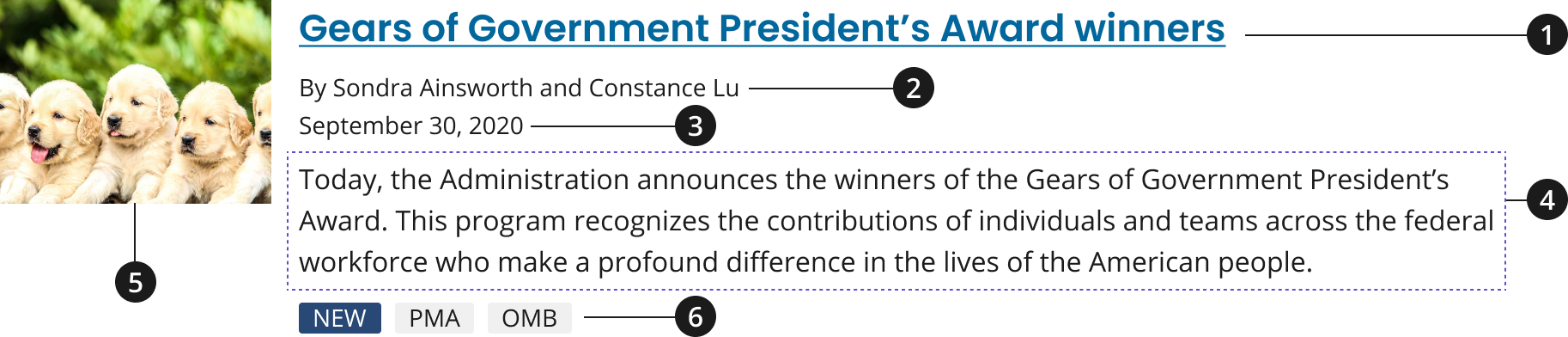
Headline
Byline (optional)
Date (optional)
Description
Media thumbnail or calendar icon (optional)
Tag (optional)
Variations
Choose from the following types of collection components based on your page’s content design or organizational needs.
| Variant | |
|---|---|
| Default Collection | Use the default collection component to include a headline and description for each of your collection items. The following attributes are also available but optional: media thumbnail or calendar date, and/or metadata such as a publishing date, byline, and tags. |
| Condensed Collection | Use the condensed collection to only include a collection item’s heading and an optional website name, reducing the amount of space between collection items. |
Usage
- Do not add list items to a collection that use both the calendar and media icons.
- When showcasing a group of events in a collection use the optional calendar icon.
- To provide users with quick visual cues for each specific item in your collection use the optional media thumbnail.
- Use the optional byline when providing the name of a content item’s author.
- Add an optional byline and/or date after your collection item’s headline to create a sense of content hierarchy within each of your items.
- Only include tags for your collection items if your website uses taxonomies to organize content.
- Include a heading before your collection to introduce your list items.
- Use descriptive terms as your heading to group your list items, such as their collective content type, whether the items are timely, etc.
- If collection items do not need further context within a description to be understood by a user, use the condensed collection variant to only feature collection items’ headings within a list.
Where to use
- Use this component on homepages, landing pages, and inner pages.
When to use
- To group related content (articles, pages, events, etc.) together based on content type, topic, or timeliness.
When to consider something else
- Displaying large images or other media. Collection list items can feature small images to provide users with quick visual cues for specific item; however, these items are not the focal point for this component.
- Alternative: Card, using the 3 Card row pattern
- Alternative: Promo Block
- When featuring items or CTAs that are not relevant to one another and should not be grouped together, or showcasing CTAs for major initiatives or content marketing items that should be described further through an image and description.
- Alternative: Promo Block
- Showcasing one primary CTA that should be more prominently displayed than all other information on the page.
- Alternative: Hero with CTA button
Best Practices
Character limits
Character limits are strongly recommended to ensure text is concise, scannable, and not visually distorted.
Character limits are based on best practices and when a line of text will be forced to wrap onto a second line of text on desktop.
- Collection heading (Use for the collection pattern only): 45 characters
- Headline: 75 characters
- Description: Concise, 2-3 sentence description of the page content
External Links
An external icon will be automatically added to all collection items that link to non-federal government (.gov) websites. This icon will be added to the end of a collection item's title to indicate that the link will go to an external site. The external icon can be overridden to display or be hidden regardless of the link.
External Link Overrides
To override an INTERNAL link and display it as an EXTERNAL link, add the following class to the collection item. Using this class will add an external icon to the collection item.
usa-collection__item--external
- NOTE: This class should be added to the HTML element that already has the class
usa-collection__item.
To override an EXTERNAL link and display it as an INTERNAL link, add the following data attribute to the anchor (<a>) element of the collection item. Using this data attribute will remove an external icon from the collection item title.
data-ncids-internal-link
- NOTE: This should be the element that has the class
usa-link.
Examples of the HTML can be found below in our Code Snippets section.
Accessibility
- Use unordered lists and list items. Use a
ulfor a collection and anlifor each item. This allows screen readers to enumerate the items in the collection and allows shortcuts between list items. - Ensure link names are unique. Unique names not only help users using assistive technology distinguish between links, but help all users scan the page.
Code Snippets
Default collection
The optional dates displayed within a collection should use a <time> html element and include a datetime attribute. The datetime attribute translates dates into machine-readable format, allowing for better search engine results or custom features such as reminders.
See MDN for more information on the <time> element.
-
Monica M. Bertagnolli, M.D., begins her tenure as the 16th director of the National Cancer Institute on October 3, 2022. She previously served as the Richard E. Wilson Professor of Surgery in the field of surgical oncology at Harvard Medical School, a surgeon at Brugham and Women��’s Hospital, and a member of the Gastrointestinal Cancer Treatment and Sarcoma Centers at Dana-Farber Cancer Institute.
-
A new study finds that former smokers who stick to a healthy lifestyle have a lower risk of dying from all causes, including cancer and heart and lung disease, than those who don't have healthy habits.
-
A prospective study of half a million tea drinkers in the U.K. suggests potential mortality benefits of drinking black tea may be associated with a lower risk of death.
-
A study found equivalent amounts of 7 different activities were associated with a lower risk of death from any cause, cardiovascular disease, and cancer.
-
NCI, part of the National Institutes of Health, will award $23 million to four academic institutions to establish centers of excellence that will conduct research on the role of telehealth in delivering cancer-related health care, a practice that became more prevalent during the COVID-19 pandemic.
The awards will establish NCI's Telehealth Research Centers of Excellence (TRACE) initiative, which is being supported by the Cancer MoonshotSM, a White House initiative first launched in 2016 and reignited by President Biden in 2022 to accelerate the rate of progress against cancer. The awards are to be distributed over five years, pending availability of funds.
-
This collection item is an external link that goes to Google.
-
This collection item is an internal link that is being overridden to display as an external link.
-
This collection item is an external link that is being overridden to display as an internal link.
Condensed collection
Default with media
-

Monica M. Bertagnolli, M.D., begins her tenure as the 16th director of the National Cancer Institute on October 3, 2022. She previously served as the Richard E. Wilson Professor of Surgery in the field of surgical oncology at Harvard Medical School, a surgeon at Brugham and Women’s Hospital, and a member of the Gastrointestinal Cancer Treatment and Sarcoma Centers at Dana-Farber Cancer Institute.
-

A new study finds that former smokers who stick to a healthy lifestyle have a lower risk of dying from all causes, including cancer and heart and lung disease, than those who don't have healthy habits.
-
A prospective study of half a million tea drinkers in the U.K. suggests potential mortality benefits of drinking black tea may be associated with a lower risk of death.
-

A study found equivalent amounts of 7 different activities were associated with a lower risk of death from any cause, cardiovascular disease, and cancer.
-

NCI, part of the National Institutes of Health, will award $23 million to four academic institutions to establish centers of excellence that will conduct research on the role of telehealth in delivering cancer-related health care, a practice that became more prevalent during the COVID-19 pandemic.
The awards will establish NCI's Telehealth Research Centers of Excellence (TRACE) initiative, which is being supported by the Cancer MoonshotSM, a White House initiative first launched in 2016 and reignited by President Biden in 2022 to accelerate the rate of progress against cancer. The awards are to be distributed over five years, pending availability of funds.
-
This collection item is an external link that goes to Google.
Default with calendar
-
Monica M. Bertagnolli, M.D., begins her tenure as the 16th director of the National Cancer Institute on October 3, 2022. She previously served as the Richard E. Wilson Professor of Surgery in the field of surgical oncology at Harvard Medical School, a surgeon at Brugham and Women’s Hospital, and a member of the Gastrointestinal Cancer Treatment and Sarcoma Centers at Dana-Farber Cancer Institute.
-
A new study finds that former smokers who stick to a healthy lifestyle have a lower risk of dying from all causes, including cancer and heart and lung disease, than those who don't have healthy habits.
-
A prospective study of half a million tea drinkers in the U.K. suggests potential mortality benefits of drinking black tea may be associated with a lower risk of death.
-
A study found equivalent amounts of 7 different activities were associated with a lower risk of death from any cause, cardiovascular disease, and cancer.
-
NCI, part of the National Institutes of Health, will award $23 million to four academic institutions to establish centers of excellence that will conduct research on the role of telehealth in delivering cancer-related health care, a practice that became more prevalent during the COVID-19 pandemic.
The awards will establish NCI's Telehealth Research Centers of Excellence (TRACE) initiative, which is being supported by the Cancer MoonshotSM, a White House initiative first launched in 2016 and reignited by President Biden in 2022 to accelerate the rate of progress against cancer. The awards are to be distributed over five years, pending availability of funds.
-
This collection item is an external link that goes to Google.
Packages
Import one of the following Sass partials into your stylesheet.
@forward 'usa-collection';// You may also need to import the following packages if not previously imported:@forward 'usa-tag';@forward 'usa-link';