
Card
A card containing clickable content about a single subject.
Overview
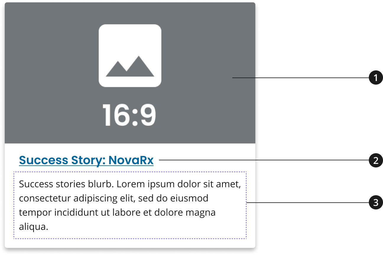
Image
Card title
Card description
Usage
- Use image to provide context for content that will be covered on the page.
- Use card title to provide a shortened version of the page title.
- Use description to provide a concise description for the page.
- (If using within a 3-Card Row Pattern) If assembling three cards within a card row pattern, use a heading to group content within these cards using a common theme.
Where to use
- Use component on home, landing, and inner pages.
When to use
- Use Card within the body of your page to showcase multiple content items such as articles, blogs, news, or events.
When to consider something else
- Showcasing call-to-actions (CTAs) for major initiatives or content marketing items that should be described further through an image and description.
- Alternative: Promo Block
- Showcasing one primary CTA that should be more prominently displayed than all other information on the page.
- Alternative: Hero with CTA Button
Best Practices
Character Limits
Character limits are strongly recommended to ensure text is concise, scannable, and not visually distorted.
Character limits are based on best practices and when a line of text will be forced to wrap onto a second line of text on desktop.
- Title: 20 characters
- Card description: 75 characters
- [If using within a 3-Card Row Pattern] Card row heading: 40 characters
Image guidance and specs
Card 16:9 Image Style
- Name - Card 16:9
- Minimum Dimensions = 1408px x 792px
- Usage - Tablet breakpoint (640px px < breakpoint < 880px)
Card 4:3 Image Style
- Name - Card 4:3
- Minimum Dimensions - 700px x 525px
- Usage - Widescreen, Desktop, Tablet Large breakpoints (breakpoint >= 880px)
For Mobile Large and Mobile breakpoints, no image will be displayed
Patterns
3-Card Row: If used on a home page and/or landing page, consider using cards in rows of three to maintain the visual consistency of the site. Learn more about this pattern on the 3-Card Row pattern page.
Accessibility
-
Aria-Labels provide an accessible name for an element. If there is no visible name for the element, use aria-label to provide the user with a recognizable accessible name.
-
The aria-label of this component is related to the anchor element of the card (the aria-label is on the anchor tag)
Code Snippets
Card

Card with an External Link
For cards that link outside of .gov and other supported sites, an external link icon will be added at the end of the card's title to indicate that the link will go to an external site. This icon is added automatically based on the link the card is going to, but can also be overridden to display or be hidden regardless of the link.
Card with Internal Link with External Icon Override
To override an INTERNAL link to be displayed as EXTERNAL, add the class nci-card--external.
Card with External Link with Icon Removed Override
To override an EXTERNAL link to be displayed as INTERNAL, add the data attribute data-ncids-internal-link to the anchor (<a>) element of the card.
Packages
Import this Sass partial into your stylesheet.
@forward "nci-card";/* When using in a group the following is required. */@forward "nci-card-group";