
Modal
A modal disables page content, intentionally interrupting a user's experience, to focus the user's attention on a single task or message.
Overview
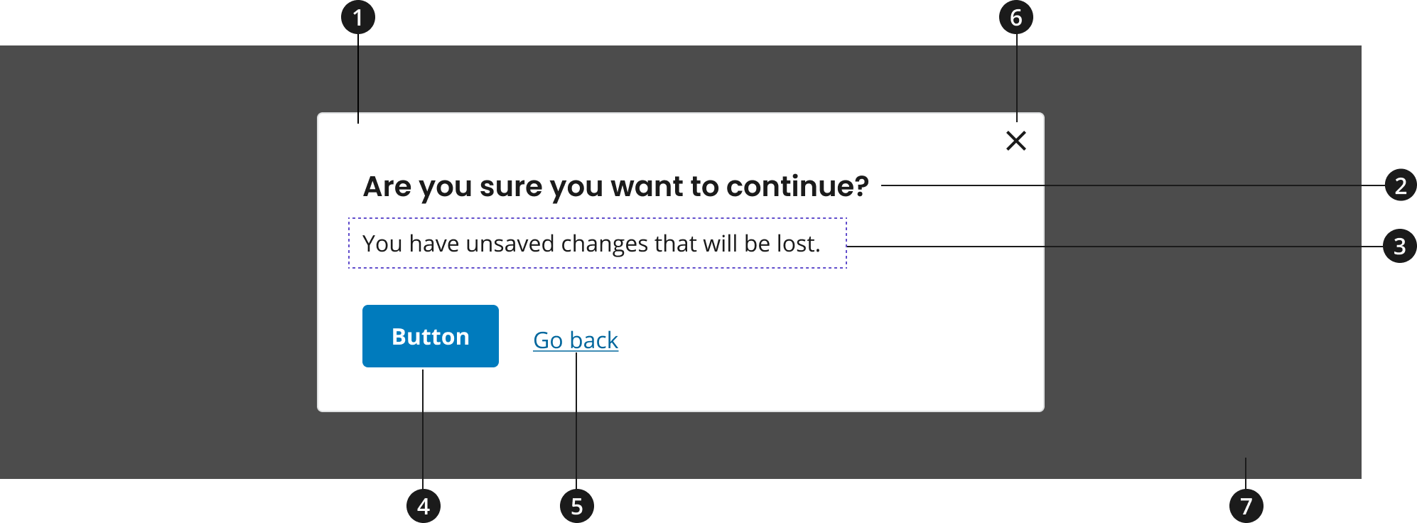
Modal background
Heading
Body text
Call-to-action button (optional for default variant)
Call-to-action link (optional for default variant)
Close icon
Transparent overlay
Variations
Choose from the following types of modal components based on your page’s content design or organizational needs.
| Variant | |
|---|---|
| Default modal | Use the default modal to present users with a task or information that requires their full attention outside of the main page content. |
| Forced action modal | Use the forced modal variant to prevent the user from exiting the modal without taking an action. Using a call-to-action link or button is required. |
Modifications
Based on your organizational needs, you might need to modify the modal component. The following modifiers are available to change the size.
| Modifier | Description |
|---|---|
| Large | Use the large modal modifier if displaying a larger amount of content. Minimizing the user’s need to scroll enhances the user experience. |
Usage
- Limit the number of modals used on a single page, reserving their usage to share critical tasks and information.
- If more space is required horizontally, use the large modal modifier. Do not allow modal content to scroll horizontally. See Large Modal Example.
- If adding longer content into a modal, adjust the modal's height to allow for scrolling vertically within the modal. See Max Height Modal Example.
- Although necessary for some uses, typically exceeding the height of the modal container is not recommended.
- If using the forced action modal variant, a call-to-action button or link is required to force the user to take an action. See Forced Action Modal.
Where to use
- Use component where it makes sense on home, landing, and inner pages.
When to use
- Use to provide important and/or optional information without taking users away from a process or task.
- Modals can help users gain further understanding regarding a topic (e.g. privacy policy, glossary definitions, etc.).
- These modals typically do not require a user to take action other than reading the information and closing the modal to proceed with their main workflow.
- Use to confirm a user's decision.
- These modals aim to force users to complete a task or make a decision that requires their full attention outside of the main workflow.
- Use this type of modal to confirm user actions or tasks that cannot be undone.
- Request immediate response from user.
- Use a modal to prevent users from moving forward without acknowledging or answering specific information in the modal.
- In some cases, it can be helpful to disable the close icon. However, if using the forced action modal, a call-to-action link or button must be used to provide users with a clear way to accept or reject the content in the modal.
- Use a modal to prevent users from moving forward without acknowledging or answering specific information in the modal.
When to consider something else
- When information can be included within the main text and/or workflow of your page.
- For instance, if it makes sense to include a definition or additional information within the context of your page, it's preferred that you keep your users' attention on the main workflow.
- When providing users with a multi-step process.
- Avoid creating complicated user flows in a modal that may take the user away from the original page. A multi-step process is better suited to an individual page that can accommodate for various intricacies involved in the user flow.
- When displaying validation messages within the context of a form.
- Alternative: USWDS Form component
- When displaying site-wide alerts.
- Alternative: Site Alert
Best Practices
- Use a brief title or verb phrase for the modal heading that describes the modal's task or purpose.
- Keep body text brief and centered around a task or the presentation of key information.
- If a modal requires users to complete a task, include a call-to-action button or link. Keep text for the button or link brief and action oriented.
Character limits
- There is no recommended character limit for the modal. Header, body text, and call-to-action text on buttons and links should be concise and action-oriented if an action is required from users.
Image guidance and specs
To keep content in modal brief, adding images is not typically recommended. However, if images are necessary, follow the guidance below:
Minimum image sizes for default modal
- 16:9 – 448px x 252px
- 4:3 – 448px x 336px
- 1:1 – 448 px x 448px
Minimum image sizes for large modal
- 16:9 – 768px x 432px
- 4:3 – 768px x 576px
- 1:1 – 768px x 768px
Accessibility
- Ensure that the modal is visible in multiple screen orientations (e.g. mobile portrait and landscape views).
- Test that modal content, close icon, and any buttons meet color contrast requirements.
- Use descriptive headings and labels.
- Ensure that modal content elements are accessible using a keyboard
- Users should be able to navigate through the elements of your modal and take action on buttons and links using their keyboard. User should also be able to close the modal by navigating to the close icon with their keyboard or pressing the escape key.
- Ensure screen reader announces modal content based on order of content hierarchy.
Code Snippets
Default Modal
To enable the default JavaScript interactions you must add import '@nciocpl/ncids-js/usa-modal/auto-init'; to the top of your JavaScript file.
If you need to customize the modal, visit the ncids-js documentation site for more information on developing your own custom JavaScript.
Are you sure you want to continue?
You have unsaved changes that will be lost.
Large Modal Example
Are you sure you want to continue?
You have unsaved changes that will be lost.
Forced Action Modal
Your session will end soon.
You’ve been inactive for too long. Please choose to stay signed in or sign out. Otherwise, you’ll be signed out automatically in 5 minutes.
Max Height Modal
Are you sure you want to continue?
Aliquam consectetur nisi non massa feugiat, imperdiet ornare libero ultrices. Nullam tincidunt mattis lobortis. Mauris hendrerit lectus vel ipsum facilisis feugiat. Sed viverra ex ac gravida commodo. Vestibulum semper commodo turpis, non pulvinar risus bibendum eu. Curabitur bibendum, ex non vehicula tristique, neque neque gravida risus, ac faucibus nulla lectus efficitur ante. Nam et lorem nunc. Ut elementum scelerisque ornare. Vivamus at vestibulum nulla. Nam sit amet quam dolor. Cras malesuada est nibh, ac varius magna vehicula eget. Aliquam consectetur nisi non massa feugiat, imperdiet ornare libero ultrices. Nullam tincidunt mattis lobortis. Mauris hendrerit lectus vel ipsum facilisis feugiat. Sed viverra ex ac gravida commodo. Etiam semper leo enim, a iaculis magna elementum non. Praesent posuere aliquet libero, nec vestibulum lacus rhoncus sit amet. Pellentesque sit amet tristique quam.
Packages
Import this Sass partial into your stylesheet.
@forward "usa-modal";@forward "usa-button";