
Promo Block
A promotional block with a title, description (optional), image (optional) and button. It typically showcases a major initiative or content marketing item.
Overview
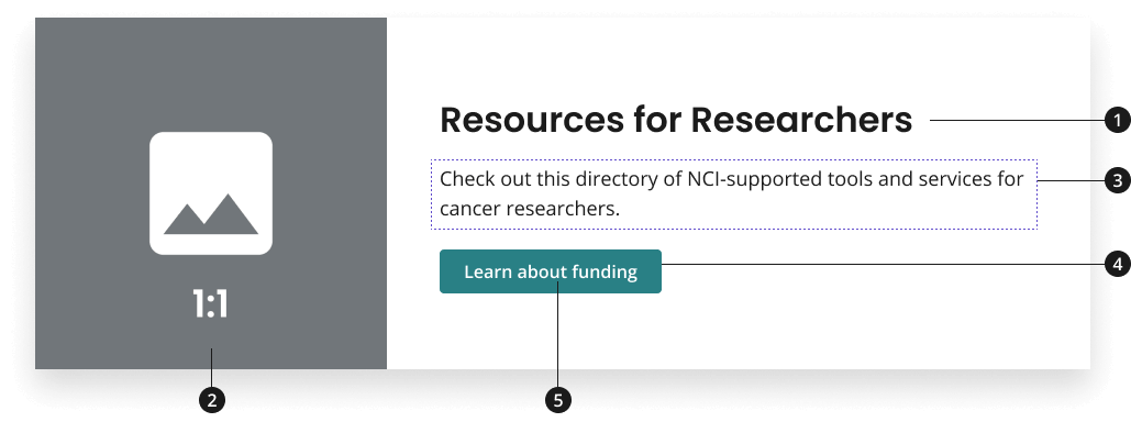
Title
Image (optional)
Description (optional)
Call-to-action (CTA) button
CTA button label
Variations
Choose from the following types of promo block components based on your page’s content design or organizational needs.
| Variant | Description |
|---|---|
| Promo block component [Default] | The default promo block is a light promo block without an image. If an image is unavailable, the promo block component variant without an image may be used. |
| Promo block with image | Use this variant to add an image to your promo block. Featuring an image is recommend in order to entice users to click on your content and to provide future context for your user. |
Modifications
Based on your page’s content design or organizational needs, you might need to modify the promo block further. The following modifiers are available to change the theme of your promo block or to change the placement of your image.
| Modifier | Description |
|---|---|
| Theme Modifier |
|
| Alternating Image Modifier [Only possible with promo block with image variant] |
|
Usage
- Use title to provide a shortened version of the page title or initiative.
- If used for promotional purposes, title should have an action-oriented CTA to entice users.
- Use image to entice users to click on promotional content and to provide context for content that will be covered on the page.
- When using two or more promo block components, add components with alternating images. Do not add other components in between this type of component; doing so can interrupt the flow of the page causing the user to stop scrolling through the page
- Use description to provide a concise description for the page or initiative.
- Use CTA button to lead users to more information. CTAs can link to either internal or external pages.
- Use action-driven button labels to entice users to click on promotional content
Where to use
- Can be placed anywhere on your home page and landing pages.
When to use
- Use promo block with an image within the body of your page to promote an important initiative or content item that needs to be displayed prominently.
- Use promo block within the body of your page to promote an important initiative or content item that does not (and will not) have a related image.
- Note: Text should be impactful and striking, as there is no supporting visual, while remaining concise and scannable.
- Depending on the theme of your web page, the promo block with an image or promo block can be set to have either a dark or light theme, which changes the background color of the block.
When to consider something else
- Sharing CTAs that do not need to take up much space within your page or are better displayed with other related CTAs.
- Alternative: Card, using the 3 Card row pattern
- Alternative: Guide Card with Image & Description or Guide Card without Image & Description (to provide users with sets of related CTAs)
- Showcasing one primary CTA that should be more prominently displayed than all other information on the page.
- Alternative: Hero with CTA Button
- Showcasing CTAs that should be more prominently displayed at the top of the page and in a set of three. Only use this option if CTAs do not require a description to be understood by the user or the CTA does not demand more space in the body of the page from a marketing perspective.
- Alternative: Hero with CTA Button + CTA Strip or Hero with tagline only + CTA Strip
Best Practices
Character limits
Character limits are strongly recommended to ensure text is concise, scannable, and not visually distorted. Character limits are based on best practices and when a line of text will be forced to wrap onto a second line of text on desktop.
- Title: 47 characters
- Card description: 150 characters
- Button label text: 20 characters
Image guidance and specs
NCIDS Promo Block 1:1 Image Style
- Name - NCIDS Promo Block 1:1
- Scale Width - 890px
NCIDS Promo Block 16:9 Image Style
- Name - NCIDS Promo Block 16:9
- Scale Width - 1280px
Accessibility
- Ensure buttons have accessible names. Buttons within the promo block should have descriptive text that can be announced in assistive technologies such as screen readers. Modify the button aria-label or use screen reader visible text to augment vague call-to-action text such as “Learn More”.
Code Snippets
Dark Promo Block No Image
NCI Annual Plan & Budget Proposal for Fiscal Year 2024 (Dark)
NCI's research strategy supports investigator-initiated research and maximizes opportunities in emerging areas of science. The FY 2024 Annual Plan & Budget Proposal aligns with NCI's vision and supports cancer research.
Learn MoreLight Promo Block No Image
NCI Annual Plan & Budget Proposal for Fiscal Year 2024 (Light)
NCI's research strategy supports investigator-initiated research and maximizes opportunities in emerging areas of science. The FY 2024 Annual Plan & Budget Proposal aligns with NCI's vision and supports cancer research.
Learn MoreLight Promo Block with External Link
For promo blocks that link outside of .gov and other supported sites, an external link icon will be added to the button to indicate that the link will go to an external site. This icon is added automatically based on the link the promo block is going to, but can also be overridden to display or be hidden regardless of the link.
NCI Annual Plan & Budget Proposal for Fiscal Year 2024 (External Link)
NCI's research strategy supports investigator-initiated research and maximizes opportunities in emerging areas of science. The FY 2024 Annual Plan & Budget Proposal aligns with NCI's vision and supports cancer research.
Learn MoreLight Promo Block with Internal Link (External Override)
To override an INTERNAL link to be displayed as EXTERNAL, add the class nci-promo-block--external to the promo block.
NCI Annual Plan & Budget Proposal for Fiscal Year 2024 (Internal Link Displayed as External)
NCI's research strategy supports investigator-initiated research and maximizes opportunities in emerging areas of science. The FY 2024 Annual Plan & Budget Proposal aligns with NCI's vision and supports cancer research.
Learn MoreLight Promo Block with External Link (Internal Override)
To override an EXTERNAL link to be displayed as INTERNAL, add the data attribute data-ncids-internal-link to the anchor (<a>) element of the promo block.
NCI Annual Plan & Budget Proposal for Fiscal Year 2024 (External Link Displayed as Internal)
NCI's research strategy supports investigator-initiated research and maximizes opportunities in emerging areas of science. The FY 2024 Annual Plan & Budget Proposal aligns with NCI's vision and supports cancer research.
Learn MoreDark Promo Block with Image

NCI Annual Plan & Budget Proposal (Dark/Image)
The Annual Plan & Budget Proposal aligns with NCI's vision and supports cancer research.
Learn MoreLight Promo Block with Image
NCI Annual Plan & Budget Proposal (Light/Image)
The Annual Plan & Budget Proposal aligns with NCI's vision and supports cancer research.
Learn MoreDark Promo Block with Alternating Image
NCI Annual Plan & Budget Proposal (Dark/Alternating)
The Annual Plan & Budget Proposal aligns with NCI's vision and supports cancer research.
Learn MoreLight Promo Block with Alternating Image
NCI Annual Plan & Budget Proposal (Light/Alternating)
The Annual Plan & Budget Proposal aligns with NCI's vision and supports cancer research.
Learn MorePackages
Import this Sass partial into your stylesheet.
@forward "nci-promo-block";/* This package should also be imported in your sass stylesheet if not already as NCI Promo Block is dependent on it. */@forward "usa-button";